understand the system
usages
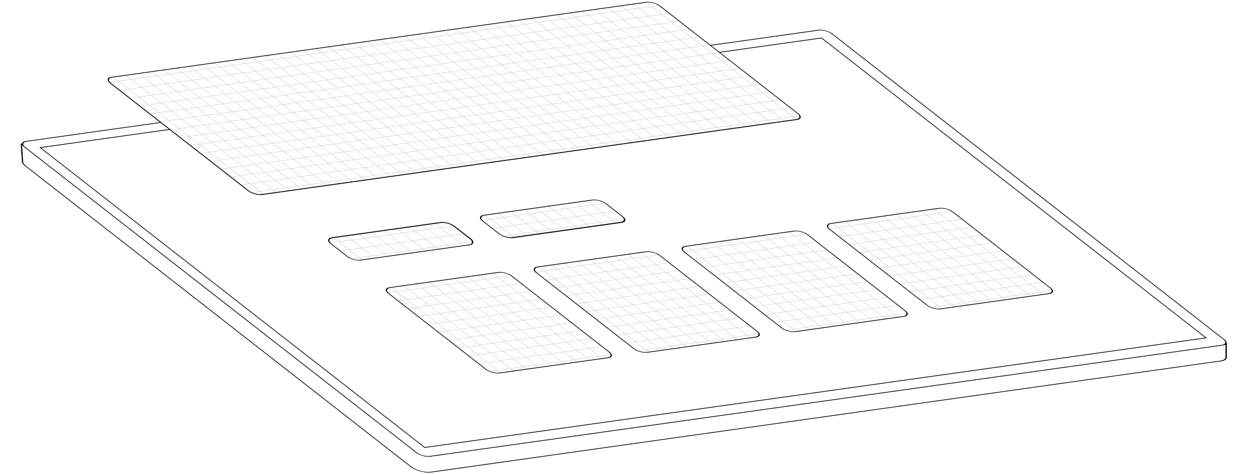
the system is built with contextual, purpose-oriented colors. each color is scoped to a single category, as shown below.
backgrounds
surfaces of UI element: section, button, cards, etc.
page backgrounds
base surfaces where your UI elements live. separated from backgrounds for better contrasts

content
texts and icons. if you use filled icons, please check "extend the system"

borders
edges of UI elements: sections, call to actions, fields, etc.

prominence
the system provides two variants for backgrounds and contents. it allows different contrasts between UI elements.
bold
high-contrast variant, used to emphasize primary elements or important sections
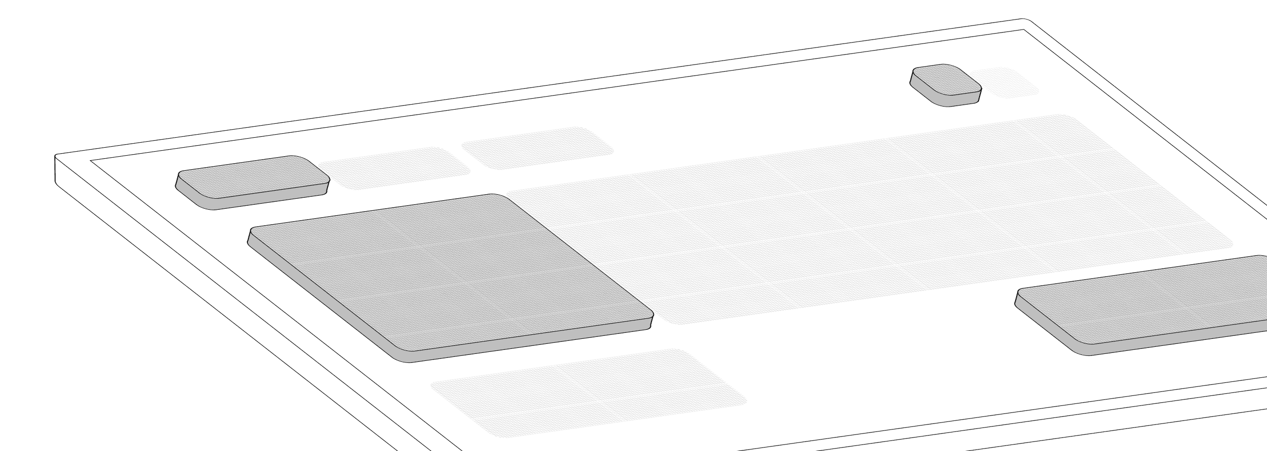
soft
low-contrast variant, used for secondary elements or sections
interactions
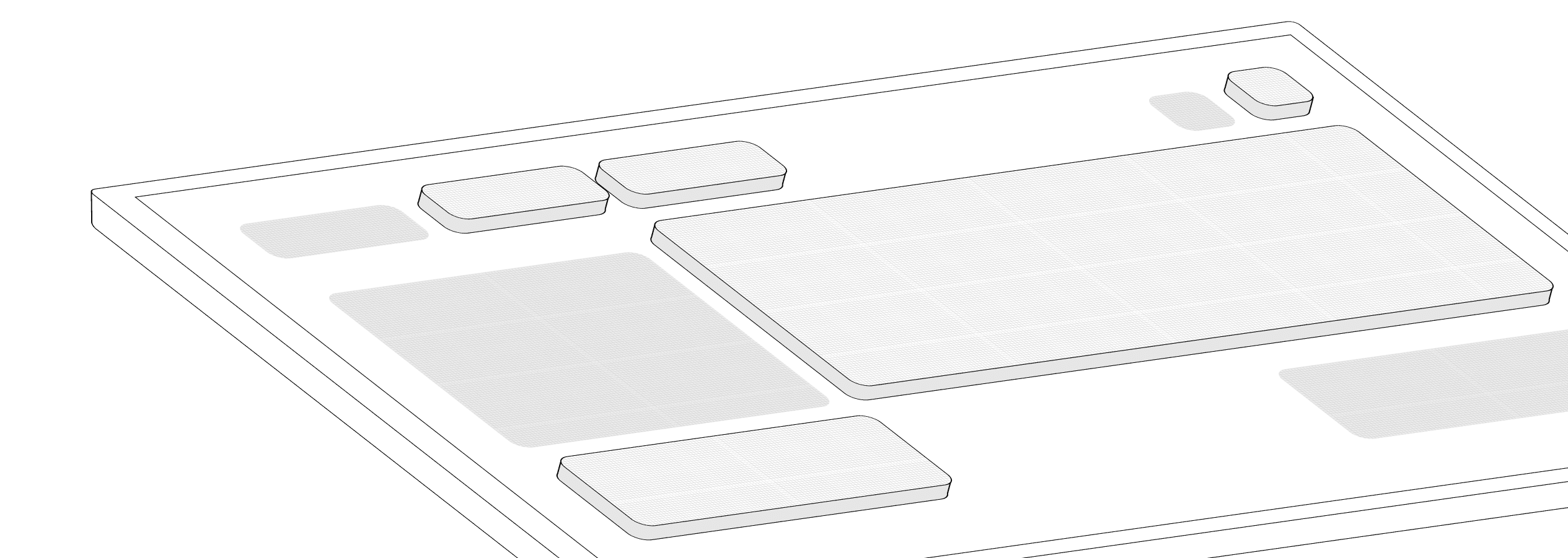
we've defined three main interactions, able to be used on mobile or desktop. disabled states purposely not included, but if needed check "extend the system".
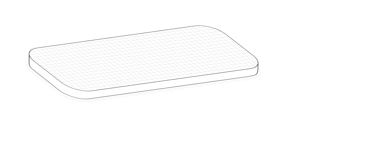
base
basic state of an element, without any interactions
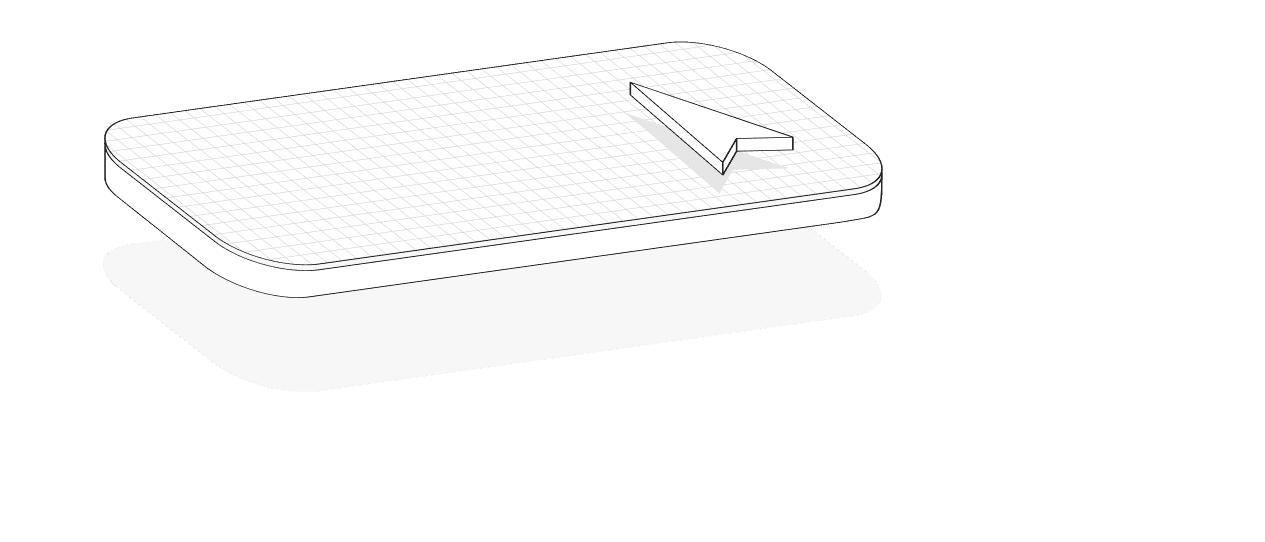
hover
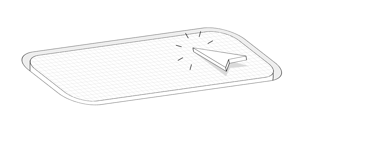
when mouse or pencil passes over an element
pressed
when an element is clicked or tapped